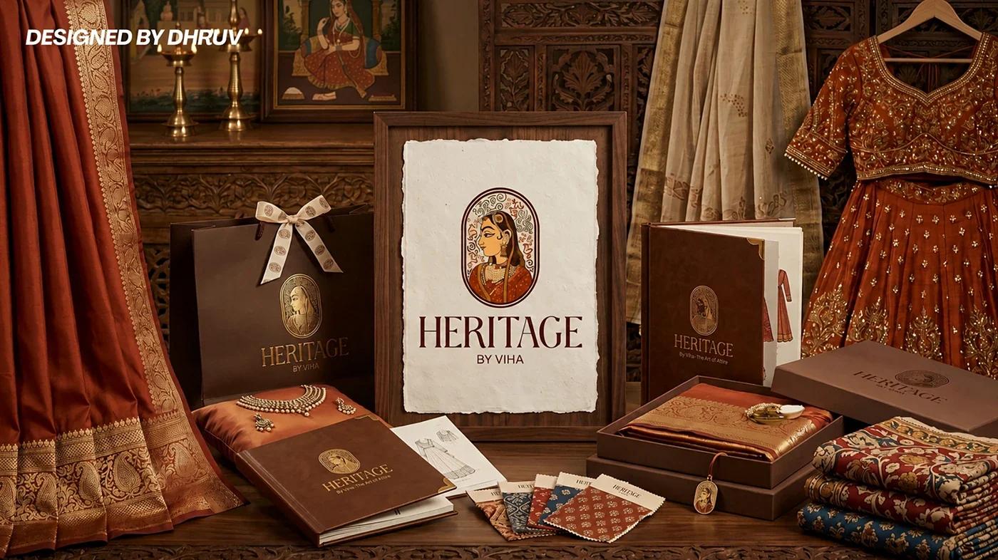
Case study — 05 / 05
2024 — 2026 · Logo & Identity Designer
Selected Marks
A collection of identities with a point of view.
A decade-in-the-making collection of marks — peacocks, burger joints, travel stories, construction firms and everything in between. Different briefs, one standard: a mark should be simple, memorable and impossible to mistake.
- Client
- Various clients
- Year
- 2024 — 2026
- Scope
- Logo Design · Visual Identity · Brand Marks
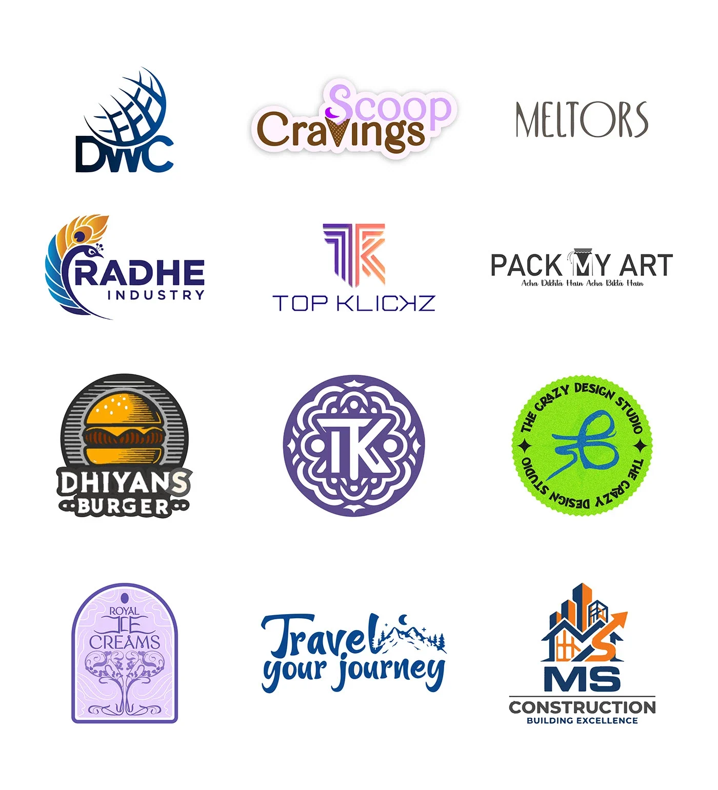
Various clients — A collection of identities with a point of view.
Scroll to read
(01) — Overview
Logos are the smallest canvas a designer gets and the hardest to get right. This collection spans food, fashion, travel, construction and culture — each mark built to work at a glance and to keep working at every size.
Some are wordmarks, some are monograms, some are illustrations. What connects them is a belief that a good mark should feel inevitable — as if it could not have been drawn any other way.
The brief
Every brief arrives with a different business, audience and set of constraints. The challenge is to listen closely enough that the solution feels obvious in hindsight — and to resist decoration for its own sake.
The approach
- 01
Start with the name and the story, not the icon. Sketch wide, then edit hard.
- 02
Test each mark at tiny sizes and in one colour before adding detail.
- 03
Build enough system around the mark — type, colour, lockups — that it survives real-world use.
Selected frames
01 images
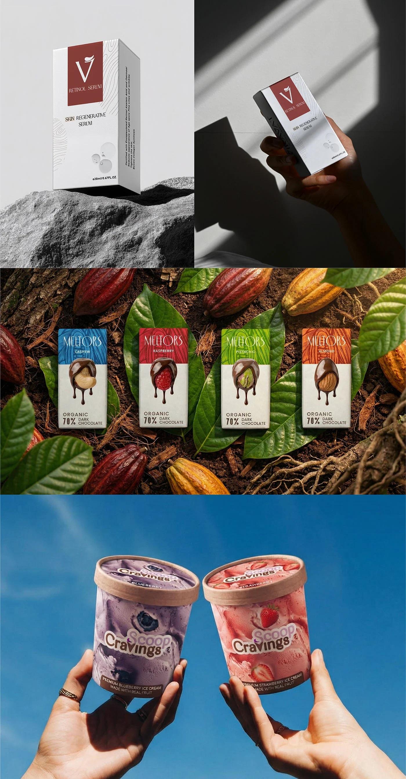
Selected identity and packaging work, 2024 — 2026.
01“A collection of identities with a point of view.”
Various clients · 2024 — 2026
(02) — Outcome
What itachieves.
A flexible set of marks for businesses across categories and scales.
Identity systems that clients can apply without a designer in the room.
A reminder that craft and clarity are not opposites.