Case study — 02 / 05
2026 · Packaging Designer
Meltors Organic
Botanical packaging for considered chocolate.
A flavour-first packaging system for an organic dark chocolate brand — botanical linework, confident colour coding and a design language that feels grown rather than manufactured.
- Client
- Meltors
- Year
- 2026
- Scope
- Packaging Design · Illustration · Art Direction
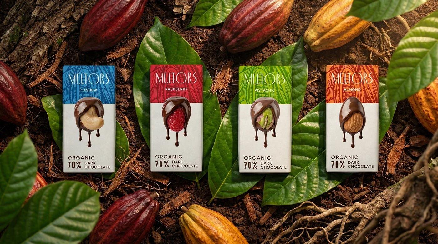
Meltors — Botanical packaging for considered chocolate.
Scroll to read
(01) — Overview
Meltors needed packaging that could hold its own on a shelf of loud, glossy chocolate — without losing the honesty of an organic product. The answer was restraint, texture and a little botanical theatre.
Each flavour gets its own deep, natural colour band, while a shared layout, wordmark and melting-chocolate illustration keeps the family unmistakably Meltors.
The brief
The brand had to communicate 70% organic dark chocolate, four distinct flavours and a premium price point — all in a small format. It needed to feel natural and crafted, not clinical or mass-produced.
The approach
- 01
Design a shared pack architecture: brand block, botanical illustration, flavour colour field and a single hero illustration of the ingredient.
- 02
Draw each botanical pattern by hand, keeping the linework loose enough to feel alive at shelf distance.
- 03
Use an off-white paper base with deep ink and saturated flavour bands so the range reads as a collection, not four separate products.
Selected frames
02 images
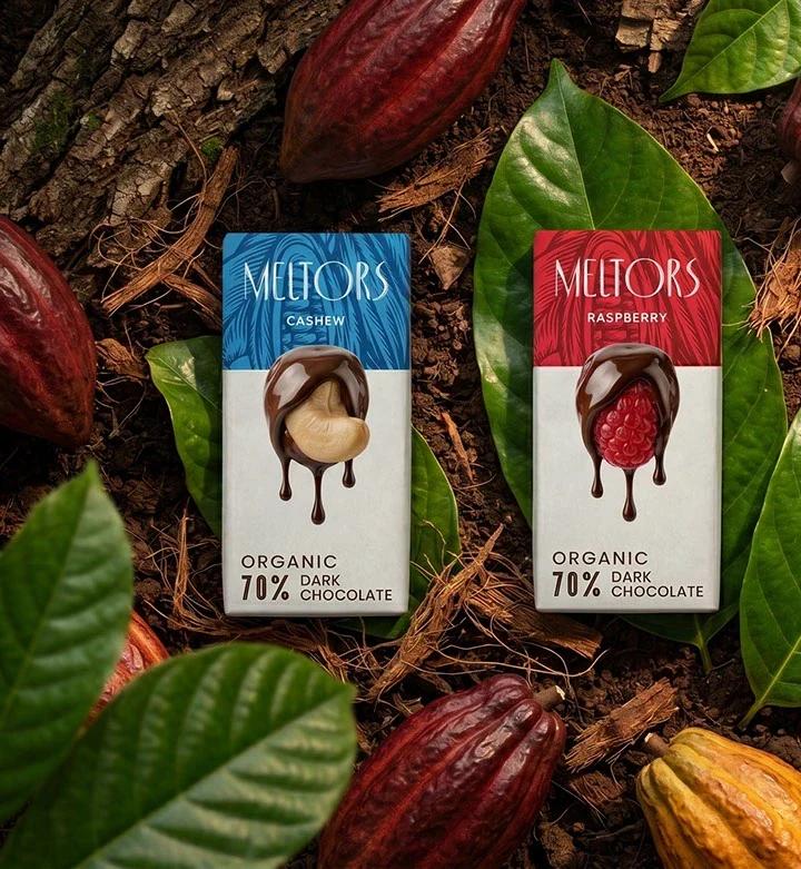
Deep flavour fields with hand-drawn botanical patterns.
01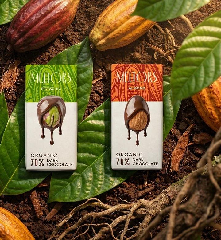
A shared layout keeps four flavours reading as one family.
02(02) — Outcome
What itachieves.
Four flavour variants with distinct personalities and one recognisable family.
A packaging system that extends naturally to future flavours and formats.
Art direction that places the product in its origin story — cacao, leaves, soil, light.