Case study — 04 / 05
2025 · Brand Designer
Scoop Cravings
A scoop of joy, built into a brand.
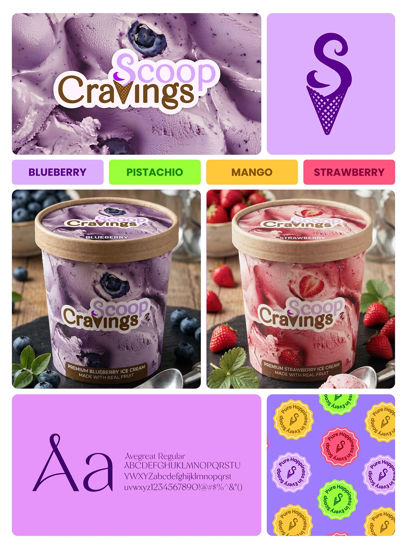
A playful, colour-forward identity for a small-batch ice cream brand — a custom wordmark, a cone-and-swirl mark and a flavour system designed to make people smile before they taste.
- Client
- Scoop Cravings
- Year
- 2025
- Scope
- Brand Identity · Packaging · Typography
Scoop Cravings — A scoop of joy, built into a brand.
Scroll to read
(01) — Overview
Ice cream is an emotional purchase. Scoop Cravings needed a brand that felt like a treat from the first glance — not another pastel start-up with a generic scoop icon.
The identity pairs a soft, hand-built wordmark with a simple cone-and-swirl monogram, then lets a bright flavour palette do the heavy lifting across tubs, badges and social.
The brief
The brand had to work across takeaway tubs, stickers, social media and a small retail counter — with a tiny budget and no existing visual equity. It needed to be distinctive, reproducible and endlessly extensible.
The approach
- 01
Draw a warm, irregular wordmark with a swirl tucked into the identity, so the brand feels handmade rather than templated.
- 02
Build a flavour-first colour system: blueberry lilac, pistachio green, mango yellow, strawberry pink.
- 03
Design a flexible badge and pattern kit for lids, stickers and social — one system, many expressions.
Selected frames
03 images
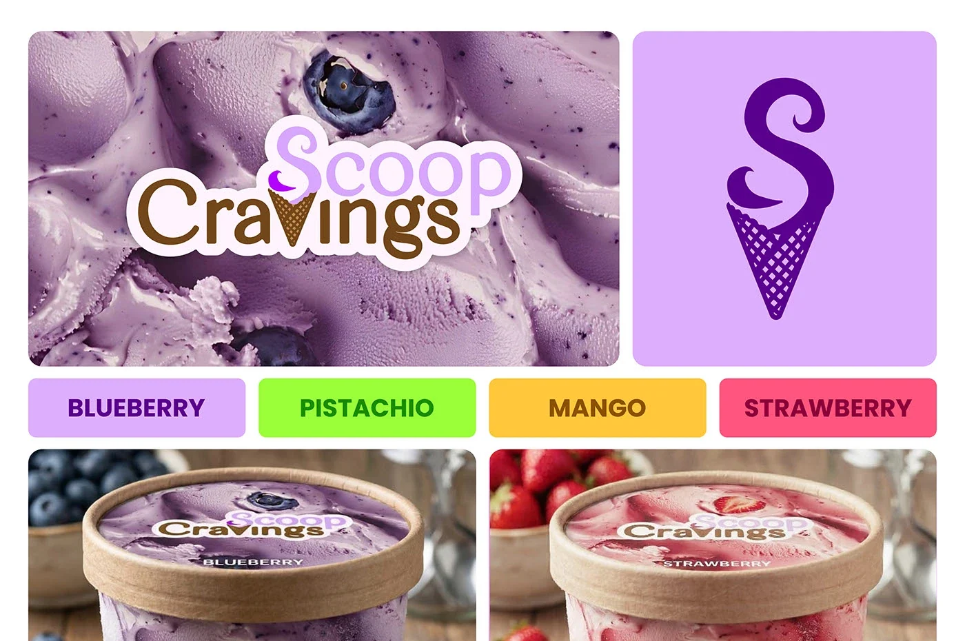
A soft, hand-built wordmark and the cone-and-swirl monogram.
01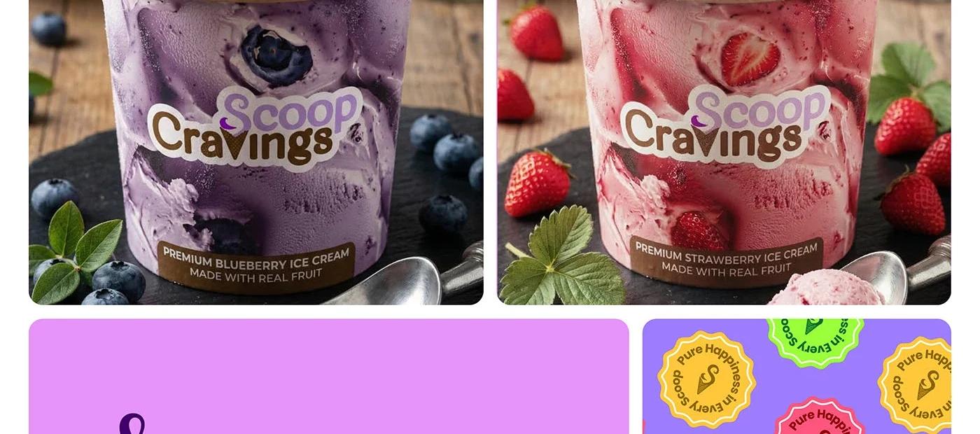
Flavour-first packaging, designed to be photographed.
02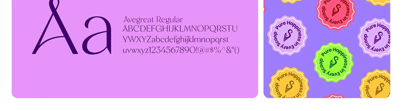
A flexible badge and colour kit for lids, stickers and social.
03“A scoop of joy, built into a brand.”
Scoop Cravings · 2025
(02) — Outcome
What itachieves.
A recognisable wordmark and monogram that work from tub lid to Instagram grid.
A flavour system that makes new launches feel instantly part of the family.
Packaging that turns a small counter into a shelf people photograph.